 I think pull quotes are great because they typically use pure typography to draw interest into magazine articles. If the typefaces we have chosen stir us emotionally, these discrete instances of pure type should send shivers down our readers spine.
This tutorial will introduce the technical steps and considerations needed to set up compelling pull quotes in InDesign. Although set up for one specific layout approach, the steps and considerations can be tailored to meet many design needs.
1. The first thing we need to do is set up the page using some kind of grid. For this tutorial I’ve set up a page layout the divides the live area of the page equally into 24 squares and then further divides each square into three equal columns. Through some experimentation I’ve chosen a leading of 11pts for my body type which led me to use an 11pt baseline and to establish the entire grid based on 11pt intervals. The first thing is to set up the page size.
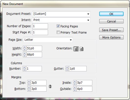
Then we’ll make the grid for the page and change the baseline intervals.
For the grids, its a good practice to place the grids on a separate layer(s) from your content. We’re going to use two grids, one that shows just the squares and another one that breaks up each square into 3 equal columns. I also like to do this in a master page so it can be applied to each new page and also changed universally if we need to.
To make the grids:
a.) double click A-Master-A in the pages panel

b.) rename Layer 1 to grid base 01 (or something similar) and also make a new layer called grid base 02. Grid base 01 will be for the squares, base 02 will be for the skinny columns. Make grid base 01 the active layer and make sure it’s above grid base 02.

c.) go to the LAYOUT menu > CREATE GUIDES and enter the following
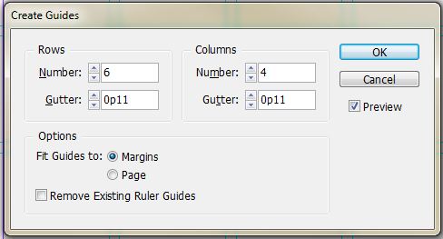
d.) lock the layer grid base 01 and then make grid base 02 the active layer. Before we make the next set of grid lines, we also want to change the color of the grid so we can visually separate the two. Go to the LAYOUT menu > RULER GUIDES and change the guide to a new color from the drop down.

then go to the LAYOUT menu > CREATE GUIDES and enter the following

e.) Open up the PREFERENCES menu > grids (EDIT menu on a PC, INDESIGN menu on a MAC) and make the following changes to the baseline grid.
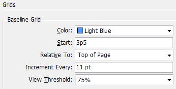
This will set the baseline to 11pts and start them from our top margin as defined in the very first step.
[A brief explanation regarding the grid sizes] The grid is based on an 11pt unit. Each large square is 9p2 x 9p2 – this means that there are 10 equal units of 11 pts that make up the horizontal and vertical dimensions. The gutters and baselines are also set to 11pts. The combination of these dimensions vertically and horizontally were used to determine the margins.
2. For this tutorial, we’re going to place the pull quote inside a mass of body text. Leave the master page and double click page 1 to make it the active page. Make a new layer for your text content – call it something like body text. Draw a text box that fills the entire live area between all four margins. Change the body text to Minion Pro at 9pts, with the leading set to 11pts. Then go to the TYPE menu > FILL WITH PLACEHOLDER TEXT. Select all the text and set it to Left Justified in the paragraph panel, additionally set the lines of text to align the baseline in the bottom of the paragraph panel.


3. We’ll break this mass of text into columns because really long lines of text are difficult to read and comprehend. With the text box selected go to the OBJECT menu > TEXT FRAME OPTIONS and make the following changes
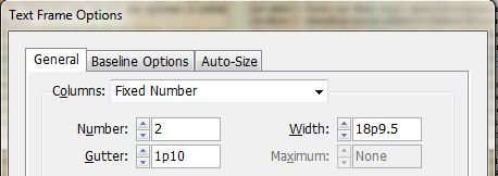
We’re breaking the text into 2 columns and introducing a gutter width(the space between the columns) that is a multiple of 11pts (1p10 = 11pts x 2) We’re using a wider gutter to make it easier for our readers to distinguish one column from the next.
4.) For this tutorial we’ll use the typeface Taller Evolution for the pull quote, download and install it before moving on.
5.) Make a new layer called pull quote and make it the active layer. The pull quote will exist within a square that is based on our 11pt unit. Select the rectangular frame tool, click on the screen and enter 14p8 (11pts x 16) for the dimensions.
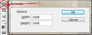
Move the frame so it aligns with the bottom of the first row gutter. Open the Align panel – WINDOW menu > OBJECT & LAYOUT > ALIGN . To align the frame with the body text select both frames and select Align Horizontal Centers

6.) Open the Text Wrap Panel – WINDOW menu > TEXT WRAP. Select the pull quote frame and then in the Text Wrap Panel select the option to Wrap Around Bounding Box, uncheck the link icon, set the wrap offsets to 11pts with the exception of the bottom, which will be set to 0.
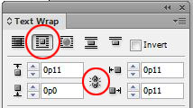
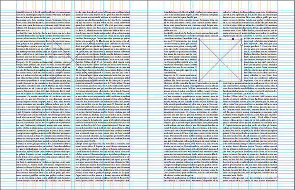
- before and after Text Wrap
7.) Select the pull quote frame with the type tool to make it a text frame. Change the typeface to Taller Evolution, the size to 39pts and the leading to 44pts (11pts x 4), also check the all caps option for this typeface (the caps for this font are tall and slender). Make the text align to the baseline in the paragraph panel.
![]()
Fill the pull quote text frame with placeholder text. It won’t look very sexy yet, so we’ll make some adjustments.
8.) With the text frame selected open go to the OBJECT menu > TEXT FRAME OPTIONS. Change the inset spacing to 11pts so that we have a 1p10 white border around all of the text (this matches the gutter for the text columns)

Now it looks even worse, so lets make further adjustments.
9.) The problem we have is that the leading for the typeface (44pts = 4 baselines) at the height we specified (39pts) is way too loose, but if we set the leading to (33pts = 3 baselines) it will be too tight. In Text Frame Options we have the ability to make a custom baseline grid for selected frames, so in order to accommodate our situation, we’ll change the baseline from 11pts to 5.5 pts to give ourselves a little more flexibility. This is an instance of where we can make the rules (the 11pt grid increment – and break the rules – dividing that in half)
1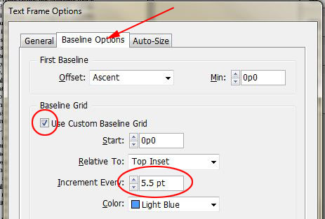
Finally, select all of the text for the pull quote and change the leading from 44pts to 38pts – this will force the type to land on the custom 5.5pt baseline and will fill the pull quote box perfectly.

We’ll wrap up here for now. We still haven’t addressed the sexiest part of pull quotes yet – the actual quote marks – so we’ll continue in Sexy Pull Quotes pt.2

Pingback: Sexy Pull Quotes pt.2 | Nick Cassway's designBLOG