
For this next graph, we will be creating a Pie Graph, a graph used to show how something (in this case certain work activities for our fictional coffee shop) is divided up from a whole – mathematically represented as 100%. Towards the middle of this tutorial, we will ungroup the graph from the original data to make some design embellishments.

1. In the same file for the previous infographic tutorials
create a new artboard.
2. Select the
Pie Graph Tool
and drag out a square more or less the
height of the artboard (about 8.5″ x 8.5″)

3.
Copy the information from this link and paste it into the data window. Click on the
check mark.
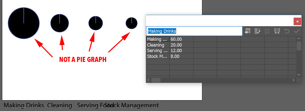
4. You will notice that the Pie Graph doesn’t look much like a real pie graph – instead, each “pie” is scaled relative to the other “pies.” To remedy this, in the Data Window, click on the
Transpose button, this will switch the columns and rows.
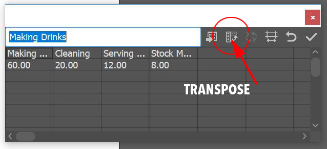 Click the check mark again
 and the pie graph will appear as a typical pie graph. Close the Data Window.

5.
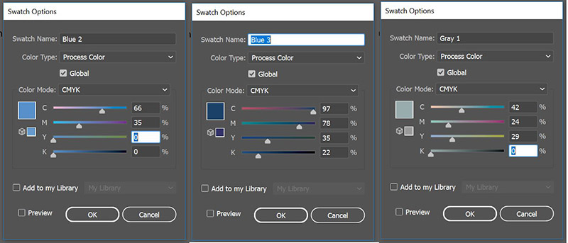
Create three new swatches:
Blue 2 C=66 M=35 Y=0 K=0
Blue 3 C=97 M=78 Y=35 K=22
Gray 1 C=42 M=24 Y=29 K=0
6. With the
Group Selection Tool (the White Arrow with the Plus sign) double click the large black shape (this will select not only the pie slice but the color in the legend as well) Apply the
Blue 3 swatch to the fill. Then with the group selection tool double click on the lighter gray slice and apply the
Blue 1 (from the column graph tutorial) to the fill. Next, with the group selection tool, double-click the middle gray slice next to the previous and apply the
Blue 2 swatch to the fill. Finally, with the group selection tool, double-click the last slice and apply
Gray 1 to the fill.

7. To create the ring-shaped pie graph, you will need to
ungroup the graph. By doing this you lose a connection to the original data, so if you are using this for your own charts, ungroup with discretion (otherwise you can use a clipping mask to maintain the data but that will be a future tutorial) Select the graph and go to the OBJECT menu > UNGROUP. Once you ungroup the graph, if you expand Layer 1 in the layers panel, you will now see there are 3 subgroups – one is for the slices and legend colors, one is for the text and one is a data group is invisible.

If you further expand the colors group you will see there are more groups within – groups for each individual color.

This means that for modifications in the following steps you will need to
ungroup the color group. Select it and go to the OBJECT menu > UNGROUP again. And then for each slice, you will need to
ungroup them as well.
8. To make the ring-shaped pie chart, select the
ellipse tool, hold down the ALT/OPT key to
draw the circle from the center of the graph, start drawing the circle and then hold the SHIFT key down to create a circle, drag the circle out so that there is about a 1/2″ ring left exposed.

9. Select the pie slices as well as the new circle and open the WINDOW menu > PATHFINDER panel, click on the
TRIM icon to cut the top circle away from the bottom pieces. The Trim Pathfinder will group everything together, so ungroup the shapes and then delete the top circle.

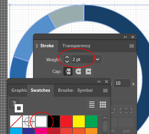
10. Select the pie slices and
change the stroke weight to 2pts and to
stroke color to white.
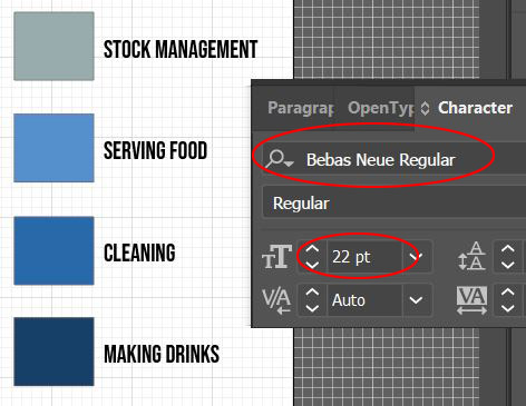
11. Select the text group and
change the font to Bebas Neue and the
height to 22 pts. Ungroup the text group.
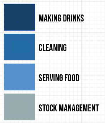
12.
Rearrange the Legend so that the largest percentage is on the top (Making Drinks) and the smallest is on the bottom (Stock Management.) Make sure to select the color and the type associated with it and move them as a unit. Select the legend colors and
change the stroke to None.
13. Select all of the text and ALT/OPT drag a
copy to the left (it will temporarily overlap the other text) Change the copied type to the percentages used in the Data Window (Making Drinks = 60%, Cleaning = 20%, Serving Food = 12% and Stock Management = 8%) Select all of the percentage type and change the fill color to white.

14.
Move the legend to the center of the graph, scale down the group as necessary.
15. Select the graph and the legend and
regroup it OBJECT menu > GROUP, drag it into the
Asset Export window and export as a JPG and PNG.
