
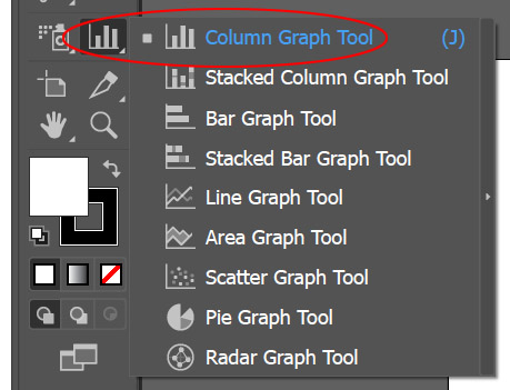
For this next tutorial in this series, we will be creating another Column Graph, but this time there is a comparison between two sets of data. To make it easy for our viewer to understand, we will be making two separate graphics for the columns and will learn some further ways to customize their look.

1. Create a new artboard
2. Select the Column Graph Tool and draw out a large square on your artboard.
3. Open this Excel spreadsheet and Copy the data, then paste it into the Data Window.
NOTE: Make sure “Year 1” is above the first column of numbers.

4. Select the graph with the Black Arrow and change the font to Bebas Neue Regular at 18pts.

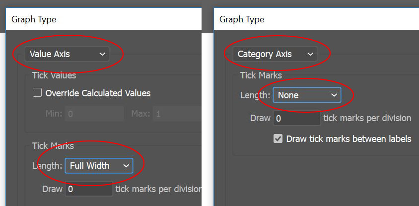
5. With the graph still selected go to the OBJECT menu > GRAPH > TYPE and click on the Graph Options Drop down to reveal Value Axis, change Tick Marks Length to Full. Click on the drop down again to reveal Category Axis and change Tick Marks to None. Click OK.
6. With the Group Selection Tool (the White Arrow with the Plus Sign next to it) double click on one of the horizontal tick marks and go to the WINDOW menu > GRAPHIC STYLES and select the Dotted Line style from the earlier tutorial.

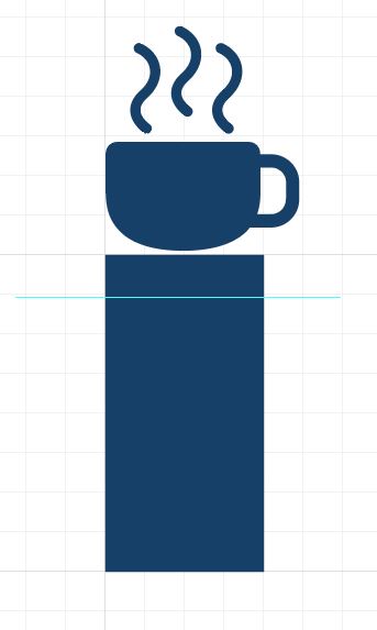
7. For this next part of the tutorial, we will be creating a custom Column Style that stretches to reflect the amount as well as displays that amount numerically. To start, download this graphic of a Coffee Cup. Open Coffee Cup.ai and copy the graphic, paste it into your document with the Comparison Column Graph.
8. Zoom into the coffee cup icon, go to the VIEW menu > SHOW GRID and then VIEW menu > SNAP TO GRID. Draw a rectangle 1/2″ wide (4 little grid squares) by 1″ high (8 little grid squares) Change the fill color to Blue 3 and the stroke to none. Go to the VIEW menu > SNAP TO GRID (this will turn off snap to grid), move the coffee cup directly above the blue column with a little separation between the two.

9. To make this column slide, a guide needs to be included with the graphic. With the line tool, draw a horizontal line near the top of the column, hold down Shift to ensure it is perfectly straight. With the line still selected, go to the VIEW menu > GUIDES > MAKE GUIDES. The guide needs to be unlocked, so go to the VIEW menu > GUIDES and click on UNLOCK GUIDES (do not click on LOCK GUIDES)
10. To make the dynamic numbering, select the type tool and click near the coffee cup and type %02 in Bebas Neue Regular at 18pts, change the color to white. In the Paragraph Panel change the justification to Align Center. Move the type so that it is centered within the coffee cup. This code tells illustrator to include a dynamic number in this location and that it should include the full value of the number followed by two decimal points (if they are part of the data set.)

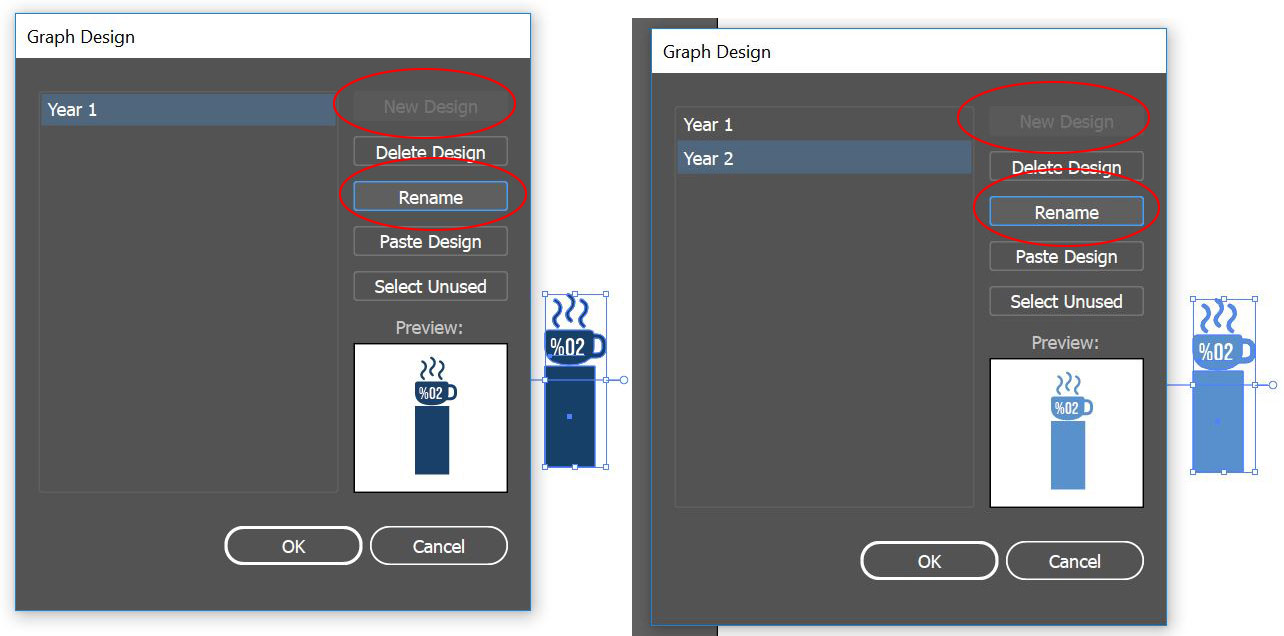
11. Select the entire custom column (rectangle, coffee cup, guide and text) and ALT/OPT drag a copy to the left. In the new copy change the fill of the cup and rectangle to BLUE 1.
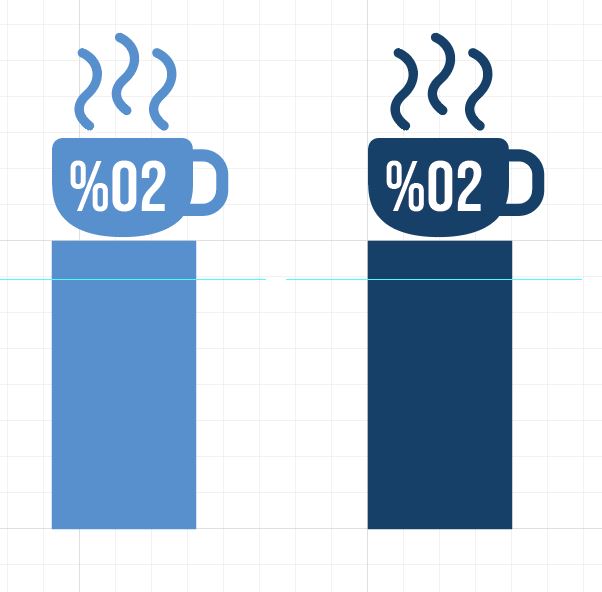
12. Select the BLUE 3 column and go to the OBJECT menu > GRAPH > DESIGN, click on New Design and the Rename it Year 1, click OK. Do the same for the other column and rename it Year 2.
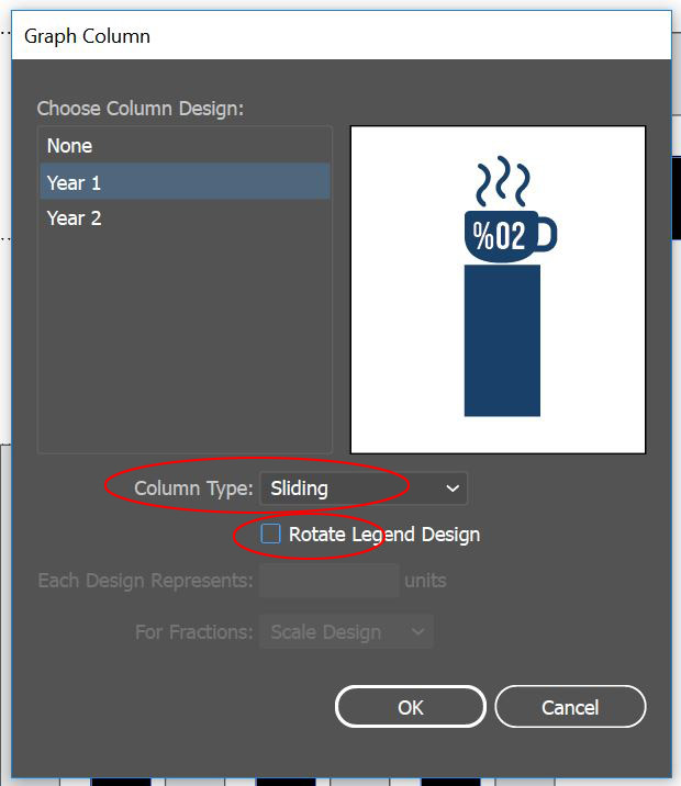
13. With the Group Selection Tool triple-click a Black Column in the Comparison Column Graph (triple-clicking will select the legend as well.) Go to the OBJECT menu > GRAPH > COLUMN and select the Year 1 design. To make the column stretch, click the Column Type drop down and change the style to Sliding, uncheck Rotate Legend Design as well, click OK. Deselect the Graph. Do the same for the lighter color columns, with the Group Selection Tool triple-click a Light Gray Column. Go to the OBJECT menu > GRAPH > COLUMN and select the Year 2 design. Make sure the style is set to Sliding and Rotate Legend Design is Unchecked. Click OK.
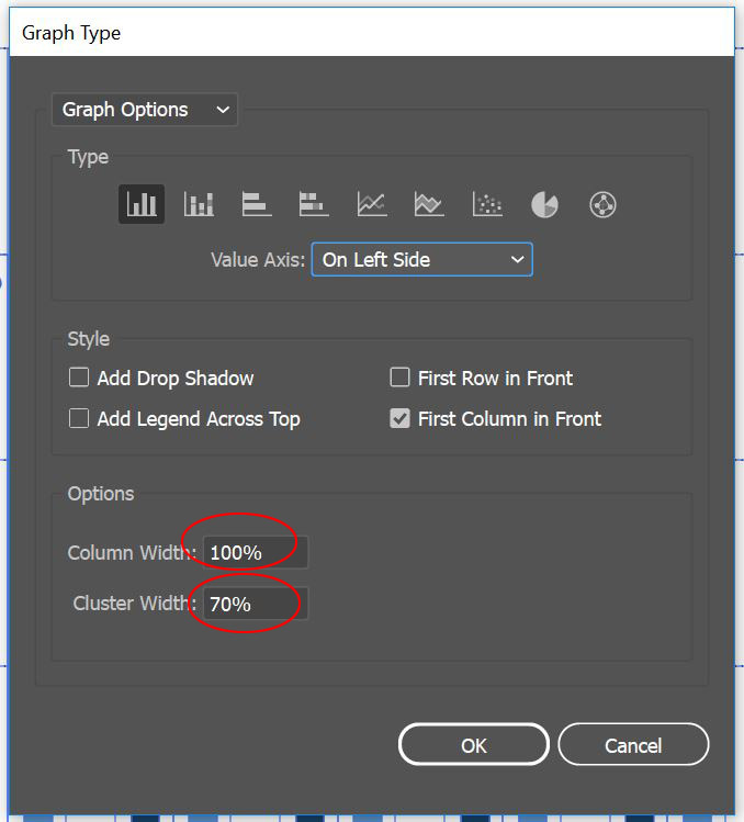
14. At this point, the columns from Year 1 and Year 2 are all equally spaced. Its important for our viewer to understand the comparison without too much struggle. To change the clustering of the columns, select the graph then go to the OBJECT menu > GRAPH > TYPE. Change the column width to 100% and the cluster width to %70. Click OK.
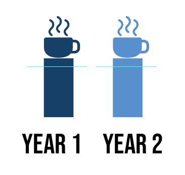
15. Reorganize the legend by putting the legend icons side by side. Use the group selection tool by double clicking on one component and moving it to the correct position. Reorganize the text as well and change the size of the text to 14pts.
16. Select the Comparison Column Graph and drag it into the Asset Export window and export as a JPG and PNG.
Photoshop, Illustrator and InDesign Tutorials
