

For the first tutorial in this series, we’ll create a simple column graph, one that represents the best selling items in a coffee shop. Our goal is to not only represent the basic information but make it easy to interpret (worst seller to best seller) as well as make it attractive to view. We’ll start off making a basic column graph and then embellish it with graphic styles and typography changes.
1. Create a new document – 11″ x 8.5″ (letter size rotated)
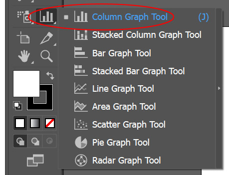
2. Select the Column Graph Tool, drag out a large square and a basic graph will appear with one column as well as the data panel for the graph.
Some Terminology and Reference before we proceed: The Vertical Axis is referred to as the Value Axis and the Horizontal Axis is referred to as the Category Axis. In the Data Panel, the first column will be the text that appears for the separate categories, the second column will represent the values attributed to the categories. The numbers on the value axis will be automatically generated by Illustrator. To avoid creating a legend and to have the categories listed at the bottom, the categories must be in quotes.

3. Copy the information from this link
If the Data Panel is still open, select the upper left cell and EDIT > PASTE (or CTRL/CMD + V) If you closed the Data Panel go to the OBJECT menu > GRAPH > DATA to open it up. Click the Checkbox to update the Column Graph.

4. Install Bebas Neue Font on your computer if you don’t already have it.
5. Select the graph with the Black Arrow, in the Character Panel (WINDOW > TYPE > CHARACTER or CMD/CTRL + T) OR also found in the Properties Panel change the font to Bebas Neue with a height of 18 pts.
6. With the graph still selected, go to the OBJECT menu > GRAPH > TYPE. Click on the Graph Options drop down and select Value Axis – change the Tick Marks to Full Width.
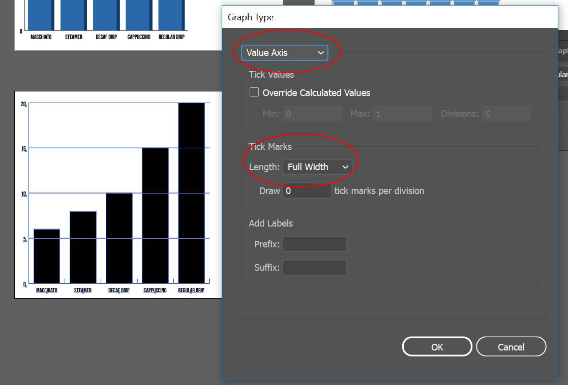
Click the drop down again and select Category Axis – change the Tick Marks to None.

Now that the Graph is configured the way we want, its time to add some style, we’ll create two graphic styles that will be applied – one for the Columns and one for the Value Axis Tick Marks.
7. Create a new swatch go to the WINDOW menu > SWATCHES and then from the Swatch Panel menu click on NEW SWATCH… create a swatch with the following formula C=87 M=60 Y=8 K=0, name this Blue 1.

8. To the right of the column graph, draw a small square, the size doesn’t matter. Change the fill to Blue 1 and the stroke to NONE. Open the Appearance Panel – WINDOW menu > APPEARANCE.

9. In the Appearance Panel, select the Fill and then at the bottom of the panel click on the Duplicate Selected Item Icon (the Page Turning Icon) to add a new Fill. Change the top fill to 50% gray and change the Opacity to Multiply.

10. With the square still selected and the top fill selected as well in the Appearance Panel, go to the EFFECT menu > DISTORT & TRANSFORM > TRANSFORM. Change the Horizontal Scale to 10% and Reference Point to the middle right-hand side. This will scale the top fill to give the square a 3D look.

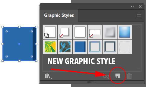
11. Open the Graphic Styles Panel – WINDOW menu > GRAPHIC STYLES. With the square still selected, click on the New Graphic Style Icon (the Page Turning Icon) to add the style. This will now allow you to select an object and apply this 3D style to it.
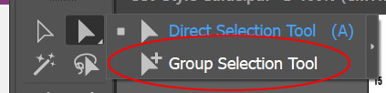
12. Select the group selection tool – this is the White Arrow with the Plus sign next to it. Click on one of the columns and then click a second time, this will select all items in that group i.e. the columns (be careful that you haven’t selected more than just the columns.)
With the columns selected, click on your saved style to apply the 3D effect to the columns.

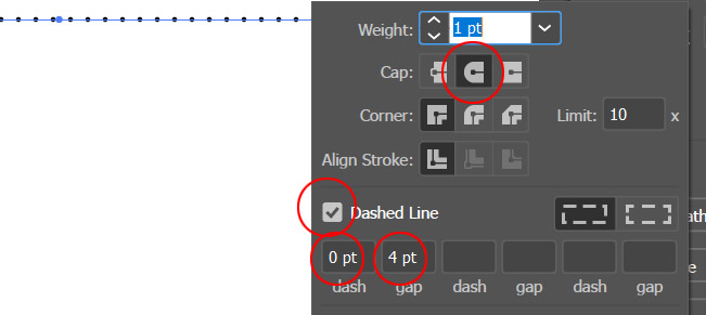
13. To the side of the graph draw a line with the Line Tool. In the Stroke Panel (WINDOW menu > STROKE or in the Properties Panel) Change the Cap Style to Round Cap, click on Dashed Line and change the dashes to 0pt and the gaps to 4pt.
With the line still selected click on the New Graphic Style Icon (the Page Turning Icon) in the Appearance Panel to add the dotted line style.
14. With the group selection tool – the White Arrow with the Plus sign next to it – click on one of the horizontal tick marks and then click a second time to select all horizontal marks. Apply the dotted line style to the selection.

To use your column graph in an external application such as PowerPoint or Google Slides you will need to export it to another file format such as JPG or PNG. Exporting to JPG will provide a white background while a PNG will not have a background (transparent). Choose the appropriate format depending on your needs, for instance, if your presentation has a color background, export to PNG so that the color is seen inside the column graph.
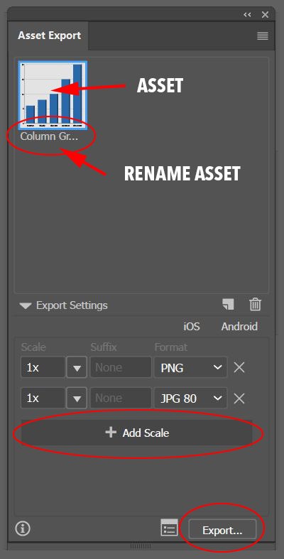
15. Go to the WINDOW menu > ASSET EXPORT. Select the Column Graph with the Black Arrow and drag it into the Asset Export Panel. Rename the asset by clicking on the name below the Thumbnail, name it Column Graph. At the bottom part of the panel leave the scale at 1x and change the format to PNG, leave the Suffix area blank. Click on + Add Scale and change the scale to 1x and the Format to JPG 80. With the Asset selected, click Export, Illustrator will prompt you for a location, choose your location and then click on Select Folder.
16. Save your file – we will be working in the same file in future tutorials.