
There is an unfortunate dearth of InDesign tutorials online – good ones at least – and when you find one that addresses the software as well as design it is always worth sharing. I found this one a while back and liked it quite a bit, but I thought it needed a bit of a rewrite for my students.
1. Considerations
There are a number of considerations to make before we actually get started laying out text and graphics on a page. Issues to be addressed in this tutorial are: type size, line length and column width; visual hierarchy; and the baseline grid.
For legibility purposes we’ll generally keep type size between 8 and 12 pts (12pts in my opinion is pushing it as it tends to feel too big on a page). Combining the type size with the column width will impact the amount of words per line (also referred to as line length) again for legibility purposes we want to try to keep the lines between 8 and 10 words. NOTE: yes, this is totally different from how you set up a paper for academic classes.
Regarding visual hierarchy – there needs to be a clear understanding of what is the most important “at-a-glance” information on the page, this is typically the headline followed by the deck or subheadline of the story and then of course followed by the content of the page. Type size and/or style should be distinct for each of these areas and generally we don’t want to use more than 2 typefaces and no more than 3 sizes per page.
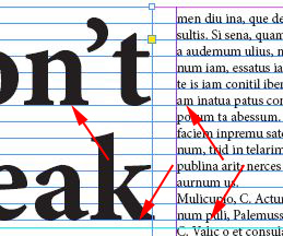
The baseline grid is a series of evenly spaced horizontal lines that aligns to the baselines (the bottom) of the typeface. This is set up to match the leading of the chosen typeface in its body type size. (Leading is the distance between lines of text – from baseline to baseline.) In our document we will ensure all type aligns to the baseline grid.
2. Setting up the document
Create a new file – set the page size to letter (51p0 x 66p0) with 4 columns and the gutter (the space between columns) set to 1p6. The margins can be left at 3p0. [The unit of measurement we’re using is in Picas. I Pica (1p0) = 12 pts, 6 Picas (6p0) = 1 inch.]
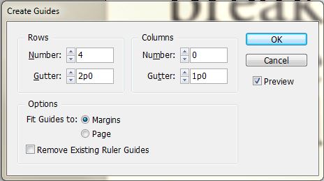
Once the new document opens, go to the LAYOUT menu > CREATE GUIDES and choose 4 rows with a gutter of 2p0. This will divide the page into 4 equal vertical spaces.
3. Choose your typeface, size and leading
Draw a text box that fills the entire live area (the space between the margins – pink lines.) With the box still selected go to the OBJECT menu > TEXT FRAME OPTIONS and change the number of columns to 4 and the gutter to 1p6 to match the document column grid.

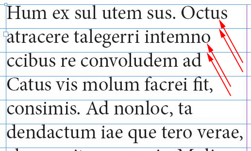
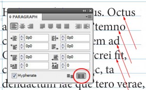
Select a typeface – for this tutorial I am going to use Minion Pro, it’s pretty much the default font for InDesign and comes in a variety of styles. Set the the size to 10pts and the leading to 12. Fill the box with text – TYPE menu > FILL WITH PLACEHOLDER TEXT. Turn on the baseline grid – VIEW menu>GRIDS & GUIDES > SHOW BASELINE GRID and take note that the bottoms of the letters do not sit on the grid. With the text box still selected go to the WINDOW menu > TYPE & TABLES > PARAGRAPH and select the align to baseline grid button on the bottom of the panel.
By default, the baseline grid is set to 12pts so we didn’t have to change it. If we had chosen another size for leading we would go to the [MAC] INDESIGN menu > PREFERENCES > GRIDS or [PC] EDIT menu> PREFERENCES > GRIDS to change the spacing as well as where the grid begins on the page. We now want to ensure that all of the rest of the type sizes we choose use a multiple of our baseline (12pts) for their respective leading.
4. Create the headline and subheading
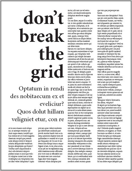
With the rectangular frame tool draw a box that is two columns wide by two rows high. With the box still selected go to the WINDOW menu > TEXT WRAP, choose the wrap around bounding box option with a distance of 2p0 from the bottom of the box. This will force the body text to conform to the shape of the headline box and provide extra space below.
 Change the frame to a text box by going to the OBJECT menu > CONTENT > TEXT. Change the type style to bold, the size to 90pts and the leading to 84pts (7 x 12pts). In the paragraph panel align the type to the right and select the align to baseline grid option. Type “don’t break the grid” into the text box.
Use the rectangular frame to draw another box directly below the headline box that is two columns wide by one column high. It will take on the text wrap properties from before. Resize the new rectangular frame by dragging the center handle up one grid line. Change the type style to medium, the size to 30pts and the leading to 36pts(3 x 12pts). In the paragraph panel align the type to the right and select the align to baseline grid option. Fill with placeholder text.
That’s it, you’re done.

Pingback: 9.15 Tuesday – Typography & Design