![]()
A student asked if it would be possible to convert a drawing from full color to black and white in InDesign. The answer is “of course you can but why would you want to do it when you have better tools in Photoshop?” The method uses InDesign’s effects Palette to do the conversion which is why this questions lends itself nicely to making a tutorial exploring Transparency.
Let’s get the question out of the way first and then we’ll make a more thorough exploration of Transparency.
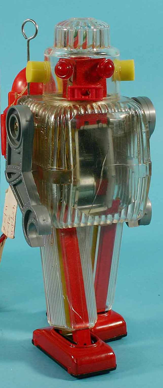
1. Make a new document and then place (FILE menu > PLACE) in a color photograph, I’m going to use this image of a toy robot, but you can of course use any image of your choosing.
2. Select the placed image with the selection tool (black arrow) and change the fill color of the content box to black, paper or registration (it doesn’t matter which)
3. Select the image with the direct selection tool (white arrow) and change the blending mode for Graphic in the effects palette to “Luminosity”


Why does this work? The blending mode Luminosity will take the Hue (color) and Saturation (color intensity) from the base – in this case black or paper – and use the luminosity (the black and white information) from the graphic. In this case, since black and paper have no saturation info it turns the graphic into a black and white image. However, if you’re really serious about black and white, I would highly recommend using the Black and White adjustment tool in Photoshop as it gives you the highest level of control over the resulting image.
But that’s not to say we can’t make adjustments in InDesign and get some interesting effects. Let’s see what else we can do with just Transparency.
4. Make a copy of the image you placed into InDesign. Select it with the Black Arrow and in the effects palette change the Fill to a lower percentage, this will begin to add color back into the image but keep it desaturated – this is the equivalent of using the Hue and Saturation adjustment in Photoshop and lowering the saturation setting.
As we can see, InDesign allows us to change the Transparency of not just the entire object, but the stroke, fill and when applicable the graphic filling the object as well as Text.

5. Copy the original object again, this time change the fill color from black, paper or registration to a swatch color or one of your choosing. With the graphic blending mode still set to Luminosity the image will create a mock Duotone – a two tone image made up of a color and black.

6. For this next example we’ll use a black and white original image with the Screen setting. Place in this graphic of a grunge texture, change the fill of the graphic frame to something other than paper or black. Select the image with the Direct Selection Tool (white arrow) and change the blending mode in the Effects Palette to Screen. The darkest tones in the image now are the most opaque version of the fill color, the lightest tones then get mapped to lighter versions all the way down to white. I think this is really useful when you want a solid color in your layout but need a little grunge or noise introduced to make it look not so flat.

7. This next example will use the transparency settings for text. Place a black and white image into InDesign, you can use this one of my cat “Miss Kitty” if you’d like. Create a new text box and type something into it (“Kitty” for instance) change the typeface to something big and chunky (I used Impact for this example and change the point size to something like 144pt. Highlight the text and change the color to the Yellow Swatch, then select the text box itself and make sure the fill is set to none. Move the text box over the image of Miss Kitty. With the text box still selected, open the Effects palette and change the Text blending mode to Overlay (Overlay will either multiply – make darker areas darker – the base image or screen – make lighter areas lighter- based on the original image,middle gray will have no effect.) Since yellow is lighter than most of the base color of Miss Kitty, it lightens up areas that the text overlaps the image.

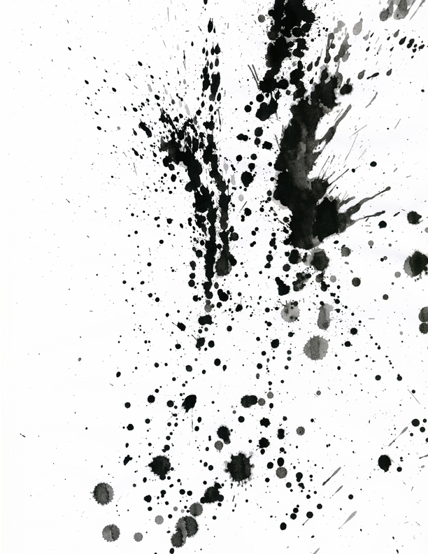
8. Final Example. We’ll call this one the fashiony splatter effect. For this either clear out your current InDesign page or make a new page and download these two images malemodel.jpg and splatter.jpg. Place malemodel.jpg into your page (it’s sized at 8.5 x 11 so it will fit the entire page) In the layers palette lock the current layer and make a new one.

Place splatter.jpg into your page (again, it’s sized at 8.5 x 11 so it will fit the entire page) With the content box still selected, change the fill color to one of your color swatches (I used Cyan) You won’t see a change at this point because the splatter graphic is not on a transparent background. Select the graphic with the Direct Selection Tool (white arrow), in the Effects palette change the blending mode for graphics to Screen, the blacks in the splatter graphic will now be replaced with tints of the Cyan swatch. Finally, to make the white disappear from the background of the splatter image, select the content box with the Selection Tool (black arrow) and in the Effects palette, change the blending mode of object to Multiply.

I like creating overlays this way in InDesign (as opposed to Photoshop) for compositions as it gives a high degree of flexibility and I can match my swatches without any problems. There are endless ways to play around with Transparency and I encourage you to experiment with the possibilities. As a reference, I have included descriptions of all the blending modes available in InDesign below.
Photoshop, Illustrator and InDesign Tutorials
