Continuing on our theme of everything is customizable and therefore should be customized we’re going to take a look at some fancy modifications to text especially in regards to headlines for magazine articles. Now, its not to say that everything needs to be tweaked or adjusted, but it is important to pay attention to all aspects of your design; remember, we’re trying to do all of our work with intention. For this tutorial we’ll look at three ways of customizing headline text: first we’ll look at kerning, then we’ll look at applying a gradient to text and finally we’ll use an image to fill text. We’ll play with special effects in a separate tutorial.
Kerning is an adjustment that can be made to individual spaces between letters. This adjustment becomes especially apparent when words and titles get blown up to larger sizes (as in headlines) We use kerning to adjust for awkwardness when the spacing between letter is too uniform.
1. Download the typeface – click here to get the typeface Print Clearly, it’s a nice, simple clean typeface that suffers from too much space in between the letters (it looks OK at a small scale, but once it is blown up to a larger size, the spaces seem way to generous). Install the font on your system. (instructions for installing in Windows are here and for Mac are here)
2. Create a new InDesign document, use the default letter sized layout.Click on the Type tool to create a text box ![]() that goes from margin to margin and is at least 1 1/2 inch (108 pts or 9 picas) high. In the box type “fancy headlines” without the quotes, highlight the text and change it to the Print Clearly typeface, change the size to 80 pts. It should look something like this.
that goes from margin to margin and is at least 1 1/2 inch (108 pts or 9 picas) high. In the box type “fancy headlines” without the quotes, highlight the text and change it to the Print Clearly typeface, change the size to 80 pts. It should look something like this.

notice the really awkward spacing between the f and the a, the c and the y, the e and the a, the n and the e, the e and s, etc… With a bit of work we can get the kerning under control and make the headline look smashing and we’ll even be able to make it larger and still fit within the text box.
3. The kerning setting is located either on the Control panel (the controls at the top of the window which change based on the selected tool) or the Character Palette. The icon is the same, the character palette is shown below.

Kerning is adjusted on a pair of letters only, you cannot select an entire word and adjust all of the letter spacing at once. For that you would have to use tracking. To make adjustments place the cursor between the letters you want to adjust and type in either a positive number to increase spacing or negative to decrease spacing. You can also use the keyboard shortcut of ALT + right or left arrow keys (windows) or OPTION + right or left arrow keys (mac)
4. The following are the suggested kerning settings for this headline: You can of course make further adjustments based on your eye and personal tastes. Between the f and a -200, a and n -40, n and c -60, c and y -74. Between the h and e -60, e and a -60, a and d -60, i and n -20, n and e -40, e and s -60. Select all the text and change the size to 100 pts. It should look like this when you are done:

Applying a gradient to text. Along with changing the fill color of text or changing the stroke thickness and color, we can fill text in with a gradient. It’s a fairly simple procedure: select the text, select the fill setting for text and then apply a gradient as the fill. InDesign, however, doesn’t supply any default gradients like Illustrator or Photoshop so we will need to make one. InDesign assumes you are bringing content to it – including images, text AND color choices.

1. Download the typeface – click here to get Big Dots from dafont.com and install it.
2. Create a text box as wide as the page from margin to margin and 6 picas high (1 inch)
3. Type “fancy headlines” without the quotes in the box, change the font to Big Dots, and the size to 62pts, we won’t change any kerning for this particular piece of text.
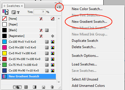
4. Before we add the gradient fill, we first need to create a gradient. Open up the Swatches palette, click on the Menu and then click on New Gradient Swatch.

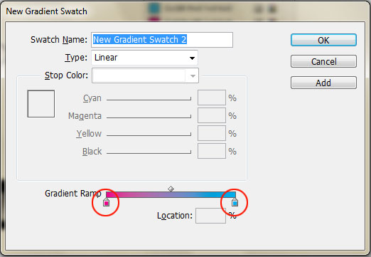
the gradient editor looks like this:

click on a gradient stop (circled) to begin the editing process.

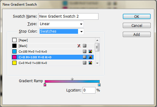
From here you can choose the type of gradient (Linear or Radial) and whether the stop color come from saved color Swatches or from colors of your own choosing. For this tutorial we’ll use the built in swatches and save color editing and swatch making for a later tutorial. Select the first stop and select a swatch color (I used magenta), then select the other swatch (I used blue) if you want to add further swatches, click below the gradient ramp to add the stop and then change the stop to your desired color – by default the new swatch will be whatever the color is above on the gradient ramp and will show up as a CMYK color. Click ADD to add it to your swatches.
5. Highlight the entire headline with the text tool. Then select the fill icon at the bottom of the tool bar, choose your new gradient swatch as the fill for the headline.

Filling text with an image is another fairly straightforward process. We set the type, turn the letters themselves into vector shapes and then place an image as the fill. The core thing to keep in mind is that once the letters have been converted to vector art, they cannot be edited as text anymore.

1. Create a text box as wide as the page from margin to margin and 6 picas high. Type “fancy headlines” without the quotes, change the font to Garamond (everyone should have this font installed by default, if not use Times), change the style to Bold and the size to 78pts.
2. Select the Text Box with the Selection tool (black Arrow), go to the TYPE menu > CREATE OUTLINES. This will turn all visible text inside the text box into vector shapes – they are editable with Direct Selection tool (white arrow) but not with the type editor.
3. The shapes created are a Compound Path meaning all of the shapes, although they are separate from each other act as one, this will allow us to fill in the entire text shape with one graphic. Download the graphic here.
4. Select the text with the Selection Tool, go to the FILE menu > PLACE and select the downloaded graphic (the graphic will not need to be scaled to fit the text)

One response to “InDesign Tutorial #2 Fancy Headlines”