
I’ve been seeing this style in a few magazines of late, I think its some kind of digital equivalent of a dymo tape label.
![]()
I think it gives layouts a kind of digitally scrapbook look and feel
Below are steps to make this effect in InDesign plus a variation on the theme
1. Create a text box (any size) set the Typeface to your liking (for this example I’m using Garamond) the type height and leading (10/16) set the text color to white. Feel free to experiment with your own variables. Fill the box with Placeholder Text (TYPE menu > FILL WITH PLACEHOLDER TEXT)
2. Highlight all of the text and open the Character palette (if not visible go to WINDOW menu > TYPE AND TABLES > CHARACTER) then from the drop down menu on the palette select Underline Options. (Strikethrough Options will set the highlighting in front of the text, this will keep the highlighting behind the text)

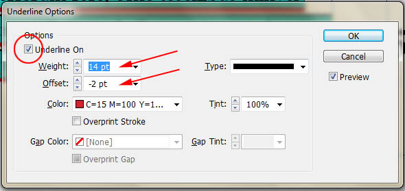
3. In the Underline Options, first turn underlining on. Next set a weight for the line that is larger then the text height. If you want spaces between the lines of text, make the weight less then the leading (in this case I used 14). Alternatively if you want no spaces between lines of text set the weight equal to or larger than the leading. Change the offset to drop the bottom of the underline below the baseline of the text (in this case -2) Set the color to the Red Swatch color.
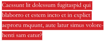
4. The final product
5. A variation on the above. Highlighting the words in white in this case and using the color from a background photograph as the text color. Below is an example.

6. Place a picture into InDesign, it doesn’t matter what the picture is for this tutorial, although if you are concerned about legibility you may want to find an image that doesn’t have too much texture in the area you are going to place the text (maybe some nice pictures from NASA)
7. In the layers palette, create a new layer and lock Layer 1 after you’ve positioned the image. On layer 2 create a text box somewhere over the image, set the typeface to Impact (or a similar big chunky font), the text height to 24, the leading to 21 and the color to Registration not black from the Swatches palette (in order for this effect to work we need the darkest possible color – registration is a CMYK color made from %100 of Cyan, Magenta, Yellow and Black – the actual black swatch is only %100 Black) Fill with Placeholder text. Set the text all caps.

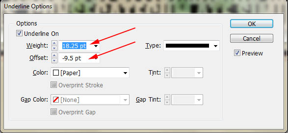
8. Below are the setting in Underline Options I used for this particular typeface and text height, notice that the sizes use decimals, this was to ensure that the highlighting was perfectly aligned to the top and bottom of the lines of type. Different typefaces and heights will require different numbers so you will need to experiment a bit to get it right. Set the color to paper (white)
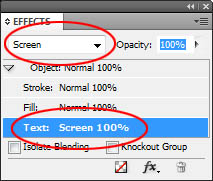
9. Finally, to get the effect to show the image where the Registration color is in the text, select the type box with the Selection tool (black arrow) go to the Effects Palette (if not showing WINDOW menu > EFFECTS) and change the blending mode of text to Screen. In this case Screen will make the registration color completely clear and will keep the white completely opaque.

5 responses to “InDesign Tutorial #4 – Highlighted text”